Great, short preso from Alex Lundry on the power of Data Visualization in the political sphere. Well worth a few short minutes to watch:
Hat tip to VizThink
Great, short preso from Alex Lundry on the power of Data Visualization in the political sphere. Well worth a few short minutes to watch:
Hat tip to VizThink
I just posted a short description of “The UXD Stack” over on 404uxd.com.
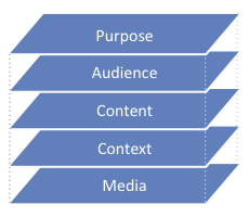 Many people in User Experience Design use different kinds of “briefs” when they get started on a project. Most of our work at EMCC UXD is application development, but we also develop demonstrations, prototypes, proof of cocept models, and even business presentations both internally and for our clients.
Regardless what we’re producing as the final deliverable, there’s a single formula for the up-front brief that we use to get a quick and successful start to the project. We think “The UXD Stack�? is the simplest yet most effective perspective for all kinds of communication projects.
Read the details and download a single-page PDF description at 404UXD.com.
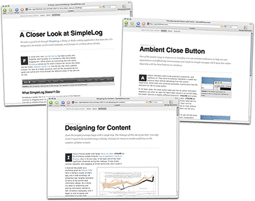
My friend and co-worker Garrett Dimon recently relaunched his eponymous blog. The results are fantastic. Garrett cites the work of Edward Tufte as his inspiration to provide visually compelling examples when writing about web design, technology, and other usability topics. The new layout is completely clutter-free, focusing completely on the topic at hand. His simple grid layout provides a variety of interesting ways to incorporate illustrations and examples that are both meaningful and pleasing to look at.
I’m looking forward to reading Garrett’s future posts. If you’re into user experience and visual design, you will likely look forward to them as well. Add his feed to your reader if you haven’t already.
As Dan Brown demonstrates on his “Representing Data in Wireframes” poster, the fidelity of your data can make a big difference in its ability to identify flaws early in the design process. The main reason designers use repetitive or otherwise lo-fi data is that it takes time and creativity to develop realistic data. Here are two tools that could help generate higher quality “dummy” data for your mock-ups and prototypes in less time than it would take for you to make up your own lo-fi samples.
Kleimo Random Name Generator
This web page uses data from the US Census to randomly generate up to 30 male and female names at a time. It has an attribute for obscurity as well. This little page can be really helpful for creating a realistic list of names. A random pop culture reference is fun to throw in every once in a while. But if your list of names reads like the credits for the Simpsons, you could loose some credibility with your clients.
Truly Random password and number generator
A lot of junk came back when I googled “random generator mask” trying to find a web-based application for generating random strings and numbers using a mask. Most of the hits were for Windows applications to generate passwords or lottery numbers. After trying several I finally found one that could be very useful for generating mock data. Solid Programs‘s Truly Random creates random strings based on a mask you provide. The mask is useful for creating numbers to match the format of your data. The downsides to this app (it’s in Windows and its not very easy on the eyes) are outweighed by the power it provides to generate plausible data quickly. It costs $19 to register Truly Random.
I wish someone would develop a web-based app to deliver both of these tools on a single, easy-to-use page (see update below). If not as a web app, a Universal Binary would be nice.
UPDATE: Benjamin Keen’s Data Generator provides the best of both tools mentioned below in an easy to use online form. He provides many useful datatypes (phone/fax, names, custom lists, etc.) that should cover most of the needs I can think of. Many of the types allow masked options editable for custom formats (like a Texas drivers license or client-specific account number). The output formats include HTML, Excel, XML and SQL. Very nice work.
When I was trying to write the conclusion for the A/C hack entry I couldn’t think of any specific examples of design improvements that came about through pure iteration, rather than an a break through in technology. I found two on my last business trip that illustrate the concept nicely.
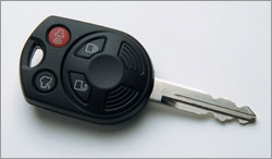 The first is the integrated automobile key with remote. I think BMW and Mercedes have been doing this for several years now. Most new cars today that include remote locks use this approach. The key pictured here is for a Ford Fusion. At the risk of sounding like Andy Rooney, it really bothers me to have too many items in my pocket. I keep the least amount of keys that I practically can on my key chain. Combining the remote and the key saves at least 30% of the space taken by separate components. I suppose that many more cars today use a remote system than did even five years ago, but there aren’t many other reasons why remotes could not have included the key since the day they were first introduced.
 An even stronger example of a simple change that makes a big difference is the curved shower rod. By curving the rod outward from the tub, much more usable space is provided when the curtain is drawn closed. Models available today provide additional elbow room from six inches to an entire extra foot. If you’ve used a shower with a curved rod you know how much of a difference that extra space makes. I first came across a shower like this in a Westin hotel a few years ago, but just about every hotel I have stayed in the last year uses one now.
So, both of these design innovations are relatively new; they’re just now becoming common in the market. Why did it take so long to realize that such a simple change could make such a useful difference? How many other products or applications that we use every day could be more useful with just a simple tweak or change?