RSS

Understanding “Purpose”

At the top of the UXD stack is purpose: “Why are we doing this project.” It’s critical to understand as much as possible about why the project stakeholders want to invest time, money, and energy into the endeavor.

I remember reading a quote about ten years ago by Elizabeth Boling that stuck with me:

“Designer” does not mean “artist” – though lots of people want to think it does. The job of a designer is not self-expression, it’s problem-solving.

The better we understand the problem, the better our chances will be at solving it. This sounds obvious, but its very easy to get caught up in what we can do without thinking about what really needs to be done.

the old Hay Net home page - have hay, need hayA great example of understanding purpose that I remember from the same era as Boling’s quote above was in Jeff Veen’s talk from the Adaptive Path UX Week in DC. He shared this example from the USDoA Farm Service Agency: Hay Net.

The purpose for this site couldn’t be more clear, could it? It’s a clearing house for people to exchange hay. You either have hay, or need hay, and the prominent links help you initiative such an exchange.

Things to consider for a site or application’s “purpose”

Here are a few items to jog your thoughts when considering purpose for a business site:

What product or service does the company offer?

Make sure you understand fully the features and benefits of what the company provides to the market.

How do they compete with this product or service?

Are they the cheapest? Are they the highest quality? Are they the innovator offering something that nobody else has? Understanding how they compete will help you craft the visual and writing style to support their desired market position.

Will the actual transaction occur online?

Many product companies sell their items online through an ecommerce site. But not all transactions are suited for the web. Typically, the larger the purchase price the less likely the transaction will occur online. If there isn’t a shopping basket involved, what is the next logical step you’d like the audience to take to move them towards an eventual sale? Seth Godin coined the term permission marketing to describe the series of smaller (and mostly non-financial) transactions that occur in the process of making a larger commitment sale. If you’re working on a project for a services firm or another company that has an involved sales cycle, I highly recommend taking Seth up on his offer to get the first several chapters of his book for free.

Understanding purpose will help drive successful design decisions throughout the project.

The more you understand about the nature of your client’s business, the better suited you’ll be for success. Keeping the client purpose in mind will help avoid resembling the quote we’re all warned by in Jurassic Park: “Yeah, but your scientists were so preoccupied with whether or not they could, they didn’t stop to think if they should.”

 
2 Comments

Posted by on April 26, 2010 in business, uxd stack


The UXD Stack

Almost a year ago I wrote a short piece on 404UXD about “The UXD Stack,” the format we use for project briefs at EMC Consulting. I’m reposting the article in its entirety here as I embark on posting a sample of the uxd stack in action each week.

Enjoy, and poke me if you don’t see something once a week.


Many people in our profession use different kinds of “briefs” when they get started on a project. A brief is a short paper defining the background and preliminary understanding for a project. Some of these documents are called “Strategic Briefs” or “Creative Briefs”.

We work on a wide variety of projects. Most of our work is application development, but we also develop demonstrations, prototypes, proof of cocept models, and even business presentations both internally and for our clients. Regardless what we’re producing as the final deliverable, there’s a single formula for the up-front brief that we use to get a quick and successful start to the project. We think its the simplest perspective for communication projects.

The UXD Stack
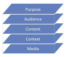
My methodology for approaching projects

“The UXD Stack” is a universal framework useful for analyzing any kind of communication. Every presentation, screen, button and image our team creates is geared towards solving a specific business problem. This is the framework we use to identify and solve such problems.

This encompassing approach considers five basic attributes of communication: purpose, audience, content, context, and media.

Purpose

Why are we doing this project?

Before we start designing, its critical to understand the business goal we’re pursuing. Understanding how the tactic delivered by our work fits into our clients’ larger strategy ensures that we’re designing the appropriate solution. This understanding should be firm at all levels of the project. We should understand how the client competes in their market all the way down to understanding the business need for the specific project. Without this understanding, we risk delivering a solution that doesn’t help the client achieve their larger goals.

Audience

Who are we communicating with?

Who will be using the application or site? Who will be viewing your presentation? What characteristics does the audience share amongst themselves? What makes them different from each other, or different from the people who aren’t included? Understanding these differences helps create segments of audiences that the final designs may be tailored to suit. Its OK to have multiple groups. List as many as needed and clearly explain what differentiates each.

Content

What does each audience need to achieve the goal?

The content is a list of understanding of scope for what people want to know and do while using the site or application. Sometimes its easiest to describe what content is not. For a movie, the content is represented as a script, not the actors or sets or posters or action figures. For a novel, the content would be the manuscript, not the book cover or page layout. For a public facing site, content might be represented as required functionality. If you’re designing a site using Web Standards, content is what’s contained in the mark-up.

Context

What style, navigation, and other formatting will help the audience?

Context is both style and organization of the content. It’s the non-verbal communication that helps the audience navigate and relate the content to their own experience and background. Context is a major contributor to the experience people have with the site or communication. Context is usually what people are referring to when they describe “look & feel.”

Navigation is certainly context – how is the content/message organized so that I can find what I’m looking for?

Visual style is also context – how is the company brand reflected in the site/interface?

A great example of context is comparing two different interfaces that handle the same data. How does the experience of using the calendar application differ on a Palm V versus an iPhone? They both use the same kinds of data for managing your schedule. But the visual style, navigation, and even interaction behavior differs greatly between the two. That’s context.

Media

What physical means will deliver the prescribed content to the defined audiences using the appropriate context?

The top four layers are technology agnostic. They describe the communication problem & solution from a functional and personal perspective. Only after the other layers are understood, do we then use the technology layer to describe the technical (or other media) means for delivering the solution.

For Best Results, Work Top-Down

I called it a “stack” because each layer supports the layer above it. Ideally, design decisions shouldn’t be made on each layer until the layer above it is completely understood. For best effect, consider each layer in order from top to bottom.

I’ve illustrated each layer with ideas from websites or applications, but the model applies to all manners of communication. This approach is equally effective for planning a billboard, a radio ad, writing a term paper, or even calling to order a pizza. Every method of communication requires a purpose, has an audience, contains content, uses specific context, and is transmitted via some kind of media. this approach can be used to plan any kind of communication endeavor.

“The UXD Stack” is simple enough to apply to a wide-range of projects, yet thorough enough to cover all the bases. It can be as detailed or simple as needed at all levels of a project. We haven’t come across a challenge on a project yet that didn’t fit into one or more layers for understanding.

Try it yourself

The 60-Second Self-Assessment

Applying this framework to your own current site or future project is a good way to consider how it could be improved to better serve your customers and your business.

Try answering these questions for your current project and see if it doesn’t reveal an opportunity for improvement or spur some creative solution for existing challenges.

Purpose – How does your current site/application help achieve your business goals?

Audience – Does it reach out uniquely and appropriately to each specific audience you need to address and serve?

Content – Does it provide all the content and functionality each specific audience needs?

Context – Do users find it easy (perhaps even consider it a pleasure) to use your site/application? If not, what keeps them from doing so?

Media – Does your site work well on portable devices? Does it face other technical challenges?

If you work on a diverse range of projects, you might benefit from the simplicity and flexibility of this format as well.

Does “The UXD Stack” make sense to you? Do you have other means for briefing your project starts? Tell me what you think in the comments.

 
Leave a comment

Posted by on April 19, 2010 in process, uxd stack


Chart Wars: The Political Power of Data Visualization

Great, short preso from Alex Lundry on the power of Data Visualization in the political sphere. Well worth a few short minutes to watch:

Hat tip to VizThink

 
Leave a comment

Posted by on January 6, 2010 in design


The UXD Stack

I just posted a short description of “The UXD Stack” over on 404uxd.com.

The UXD StackMany people in User Experience Design use different kinds of “briefs” when they get started on a project. Most of our work at EMCC UXD is application development, but we also develop demonstrations, prototypes, proof of cocept models, and even business presentations both internally and for our clients.

Regardless what we’re producing as the final deliverable, there’s a single formula for the up-front brief that we use to get a quick and successful start to the project. We think “The UXD Stack�? is the simplest yet most effective perspective for all kinds of communication projects.

Read the details and download a single-page PDF description at 404UXD.com.

 
Leave a comment

Posted by on June 8, 2009 in design, process


Marathon by 40

Marathon by 40

I know I haven’t been posting much here. But, I have been fairly active recently elsewhere on the net.

I’ve mentioned 404UXD already, so look there for UXD-related posts. But just a few days ago I started Marathon by 40 (http://marathonby40.com). I’m starting this new blog a month before I turn 38 years old. I have a personal goal to run a marathon by the time I’m 40. Considering I couldn’t run a mile without walking about a year ago, this is going to be a considerable challenge.

I’ll be blogging there to keep track of my progress and to allow my friends an easy way to keep me accountable and encourage me to stay on track.

Are you on a running program right now yourself? Stop by and let’s encourage one another!

 
Leave a comment

Posted by on August 23, 2008 in fribble


404UXD.com – You follow?

So, I’m in the middle of another drought here on Mark-Up. But, I have been a little more active on our team blog at 404UXD.com. We adopted a tumbler format over there for more frequent, more pithy posts. So, if you haven’t yet already, please check us out.

 
Leave a comment

Posted by on July 31, 2008 in fribble


960 Grid System layout tools and code sure to save design & development time

960 Grid SystemNathan Smith has launched 960.gs, a very promising framework and design toolset for layout using CSS. Besides a great foundation of code for implementing a flexible grid system, he’s created accompanying templates for sketching preliminary designs on paper and wireframing detailed designs in Visio, OmniGraffle, Fireworks, and/or Photoshop. As with any Nathan Smith endeavor, this kit is very well thought-out and executed. He’s considered many details and implemented them thoroughly.

If you’re looking to cut down development time while sketching, wireframing, or coding hi-fi prototypes in HTML, Nathan’s work in the 960.gs is sure to be a great starting point.

Read more about the whys and hows in Nathan’s explanatory post on sonspring.com, and download the framework (only 180KB for all the tools, only 4KB of actual code code compressed) at 960.gs,

 
Leave a comment

Posted by on March 26, 2008 in code, process, prototyping


Spring MIS 374 Lecture

I was thrilled that Sharon Dunn asked me to visit the 40 Acres to lecture the Spring MIS 374 class on High-Fidelity Prototypes again. The talk was basically the same as the one I delivered in the Fall, so I won’t waste disk space or bandwidth in posting a re-run. While the students didn’t have as many questions during the talk, there were several after class and many more through email.

I really enjoy sharing this talk and am considering working up a few others based on the questions that have come up after. I sure hope Eleanor and Sharon will have me back again next year.

 
Leave a comment

Posted by on March 24, 2008 in prototyping


Len memes well, so I’ll reciprocate.

I haven’t responded to memes in the past, as I tried to keep this blog more professional than personal. But Len Devanna, one of my new cohorts at EMC, tagged me today and after reading his response I’m inspired to post. Len’s the guy behind the recent EMC.com redesign. I think they did a great job and I’m looking forward to seeing how it will evolve in the months to come.

I appreciated Len’s fresh take on memes:

In the past 30 minutes, I’ve read some fascinating stuff about folks I’d otherwise have no exposure to. I’m following them now, and my social network has grown that much more. It’s also interesting to watch the rules evolve as information flows from person to person.

Indeed, I appreciated getting to know more about him, so I’ll now return the favor.

Four jobs I’ve had:

  1. My first job was sacking groceries at the local Minyard Food Store. It was minimum wage (with occasional tips), but I learned a lot about grocery store merchandizing and marketing, which would come in handy later in my career when I worked as an intern and a consultant at the FritoLay and PepsiCo IT world headquarters..
  2. During summers of high school and college I was a Lifeguard at the local public pool. My last year there I even won our local “Superguard” competition (its kind of like the olympics for life guards).
  3. In college I was an “RA” (Resident Assistant) for 3 years. Every staff I worked on was a great group of guys. A few of us still stay in touch. I’ll be back on the 40 Acres in March to lecture again on “High Fidelity Prototypes.”
  4. For most of my professional career, my wife (an elementary and middle school teacher) hasn’t understood much more about what I do other than “computer stuff.” But when I worked for Voyager Expanded Learning for a year, she actually helped me with my assignments. I was there in 1998 helping them develop websites on CDs for low-income schools. Back then not many schools had internet connections. So, we would develop colorful and fun websites for kids that complimented the curricula Voyager sold. Because the sites were on CD, schools could still teach kids how to use a browser (we even had a primitive javascript-based search engine). Sounds rather silly now, but it was a novel idea for the time. I had my most rewarding project ever there: developing a Flash-based kiosk that was part of a small exhibit at the Smithsonian National Museum of Natural History.

Four shows I DVR

  1. Texas Longhorn and Dallas Cowboys football – sports are really the only reason we have DishHD. It’s hard to watch football now any other way. I like the Voom channels (especially “Private Life of a Masterpiece” on GalleryHD), but most everything else we watch is available through iTunes or Netflix.
  2. LOST – is watched religiously timeshifted 30 minutes after it starts; that way we can see it as soon as possible without waiting for commercials.
  3. My wife and I really got into Pushing Daisies before the writers’ strike. I hope it comes back when they return. Since then we’ve been watching Wonderfalls and we’re starting Dead Like Me to scratch the itch.
  4. Did I mention how sentimental I can be? I record the very old reruns of Davey and Goliath for my kids to watch while they’re waiting to go to church. I’ve also subjected them to every single episode of Speed Racer.

Four places I’ve been:

  1. My mom is British and her side of the family all still live in England. I’ve been several times for pleasure and once for business. Hope to go back in a few years with the entire family.
  2. China was an eye-opening experience. I worked at a Cheetos plant that didn’t have any cheese (the favorite Chinese flavors were prawn and steak).
  3. Dothan, Alabama is the “Peanut Capitol of the World” and with respect to Len’s comments, is home to some of the friendliest people in the world.
  4. The place I’ve been and most want to take my wife is Venice. Someday when the kids are all off to college we’ll do the Grand Tour.

Four favorite foods:

  1. Just about anything on the menu (or on tap) at Henk’s. He’s really Dutch, but they serve the best German fare in Dallas.
  2. I could eat Sunet Beef Fajitas at Mi Cocina every day for lunch and dinner. Sunset = spicy queso with fried shoestring onions.
  3. Amy’s Ice Cream is a must-stop in Austin, TX. Mexican Vanilla with KitKat is my all-time favorite flavor.
  4. While I am thinking of dessert, my wife makes a mean Apple Custard Pie. She slices the apples paper-thin. It’s even better the morning after for breakfast.

So, there you have it, Len. Thanks for sharing, and the encouragement to actually post something on this so-called blog of mine.

I’ve invited several others to carry the torch. I’ll post their links should they decide to accept the mission.

 
Leave a comment

Posted by on February 2, 2008 in fribble


My Old School

I was thrilled back in August when Eleanor Jordan, my former professor now Professor Emeritus at UT Austin asked me to come speak to her class about high fidelity prototyping. “MIS 374 – Business Systems Development” is the capstone class for MIS undergrads. The students learn project methodology concepts and test everything they’ve learned in the 4-year program on teams to complete real-world projects for Austin-area clients.

Last Monday (10/22/2007) I drove down to Austin for the day to share a slightly modified version of the high fidelity prototyping talk I gave just over a year ago at Refresh Dallas. The class was great. They were very receptive and had great questions during and after the presentation. Unfortunately, our time was cut about 15 minutes short by a “non-specific” bomb-threat, but we got through most of the presentation and several students stayed after to chat while UTPD scanned the building.

I enjoyed the experience and will be happy to go down any time they’ll have me again.

The presentation and pre-class notes are available on the Downloads page.

 
5 Comments

Posted by on October 25, 2007 in prototyping