RSS

Geniant Joins EMC Global Services

EinsteinLast week, Geniant was officially acquired by EMC, the global storage, software, and services company. Traditionally EMC was known for their large-scale storage solutions. Over the last several years they’ve shifted their focus to a holistic approach to storing, retrieving, and securing information.

EMC acquired Geniant specifically for inclusion in the Microsoft Services group of EMC Global Services. Not too much should change in the short term. As we get fully integrated with our new team, I’m looking forward to the best of both worlds: having the increased opportunities afforded by a global organization while still working inside a super-talented user experience / design group. Given the wide range of opportunities related to EMC products and services, there should be many rewarding projects to work on.

EMCInterestingly, we learned during orientation that the “2” at the end of the EMC logo is simply an ornament. It’s never pronounced nor included in text versions of the company name. It’s only used in the type-based graphic logo. Regardless, when seen it does the intended trick of invoking thoughts of relativity, intelligence, or Albert Einstein himself.

 
4 Comments

Posted by on July 14, 2007 in business


Web Standards Basics on the Geniant Blog

The Geniant Blog

Garrett, Jared, and Nathan did a great job crafting the Geniant blog and priming it with some good posts. Now it’s up to the rest of us to fill it with content.

I took my first step towards that end this evening by posting my first article “Web Standards Basics”. I’m guessing most folks reading here are already aware of the benefits of using standards for front-end development, but we’re hoping that the Geniant blog will reach a wider technology audience. Take a look when you get a chance.

 
Leave a comment

Posted by on May 3, 2007 in code


Garrett’s Content is the Design

Garrett's articles

My friend and co-worker Garrett Dimon recently relaunched his eponymous blog. The results are fantastic. Garrett cites the work of Edward Tufte as his inspiration to provide visually compelling examples when writing about web design, technology, and other usability topics. The new layout is completely clutter-free, focusing completely on the topic at hand. His simple grid layout provides a variety of interesting ways to incorporate illustrations and examples that are both meaningful and pleasing to look at.

I’m looking forward to reading Garrett’s future posts. If you’re into user experience and visual design, you will likely look forward to them as well. Add his feed to your reader if you haven’t already.

 
Leave a comment

Posted by on February 19, 2007 in design, process, prototyping


The Prototyping of Star Wars

Death Star Canyon

Stephen Anderson provided a wonderful talk a few weeks ago at Refresh Dallas (and subsequently at Refresh06 in Orlando) on “Creating Pleasurable Interfaces: Getting from Tasks to Experiences“. He does a great job of making the squishy elements of UI design feel tangible. The truly wonderful interfaces that we use everyday are our favorites because of the intangibles that Stephen so eloquently describes in this talk. There’s a lot to learn in there and apply to any project we’re working on.

Ralph McQuarrie conceptIn this talk Stephen mentions the work of Ralph McQuarrie. When George Lucas was shopping the idea for Star Wars to different studios, he was concerned that the traditional method of providing a script to read would not do justice to the scope of setting and drama that the story would provide. He wanted something more than just words on a page to literally illustrate the characters and settings he wanted to film. So George hired artist/illustrator Ralph McQuarrie to do just that. The use of such supplemental material for movie pitches was not at all common during that time. McQuarrie later said “I understand my pictures did something to convince [20th Century] Fox to make Star Warsâ€?.

I know Walt Disney used rough sketches for storyboards in the production process, but I think George Lucas’ approach to develop such high visual fidelity illustrations was novel for selling the project. Lucas realized that there was too much room for interpretation when he only used a script; he wanted to provide more concrete examples of the vision he had for the project. That’s exactly what we do when we insist on some form of prototype to advance our project instead of relying only on a written requirements and design document.

When you’re just trying to get a project off the ground, high visual fidelity concept screens can really help make your inspiration infectious with investors and other project sponsors. Illustrating the key ideas with great visual clarity so they can get a flavor of what their investment will return.

 
Leave a comment

Posted by on November 21, 2006 in prototyping


Mock Data Generators

As Dan Brown demonstrates on his “Representing Data in Wireframes” poster, the fidelity of your data can make a big difference in its ability to identify flaws early in the design process. The main reason designers use repetitive or otherwise lo-fi data is that it takes time and creativity to develop realistic data. Here are two tools that could help generate higher quality “dummy” data for your mock-ups and prototypes in less time than it would take for you to make up your own lo-fi samples.
Kleimo Random Name Generator
This web page uses data from the US Census to randomly generate up to 30 male and female names at a time. It has an attribute for obscurity as well. This little page can be really helpful for creating a realistic list of names. A random pop culture reference is fun to throw in every once in a while. But if your list of names reads like the credits for the Simpsons, you could loose some credibility with your clients.
Truly Random password and number generator
A lot of junk came back when I googled “random generator mask” trying to find a web-based application for generating random strings and numbers using a mask. Most of the hits were for Windows applications to generate passwords or lottery numbers. After trying several I finally found one that could be very useful for generating mock data. Solid Programs‘s Truly Random creates random strings based on a mask you provide. The mask is useful for creating numbers to match the format of your data. The downsides to this app (it’s in Windows and its not very easy on the eyes) are outweighed by the power it provides to generate plausible data quickly. It costs $19 to register Truly Random.
I wish someone would develop a web-based app to deliver both of these tools on a single, easy-to-use page (see update below). If not as a web app, a Universal Binary would be nice.

UPDATE: Benjamin Keen’s Data Generator provides the best of both tools mentioned below in an easy to use online form. He provides many useful datatypes (phone/fax, names, custom lists, etc.) that should cover most of the needs I can think of. Many of the types allow masked options editable for custom formats (like a Texas drivers license or client-specific account number). The output formats include HTML, Excel, XML and SQL. Very nice work.

 
Leave a comment

Posted by on November 6, 2006 in business, code, design, prototyping


Links from the High-Fidelity Prototype Presentation

hifisliders.png

Here are the links I referred to in the presentation this evening.

I’ll try to have the deck posted by this Sunday. As promised, here’s the PDF of the deck of last Thursday’s presentation.

 
7 Comments

Posted by on September 14, 2006 in process, prototyping


Tags:

September Refresh: Prototyping

The next Refresh Dallas meeting will be held on September 14th at the Christopher A. Parr Library (see refreshdallas.org for all the details).

I’ll be the presenter this month. We’ll explore the benefits and costs of using Hi-Fi Prototyping using a real life case study as context.

Hope to see you there!

UPDATE: Thanks to everyone at Refresh Dallas for hosting and attending the meeting last week. I’ve formatted the presentation for print, and it is now available here as a PDF.

 
1 Comment

Posted by on September 4, 2006 in prototyping


Tags:

simple functional design improvements

When I was trying to write the conclusion for the A/C hack entry I couldn’t think of any specific examples of design improvements that came about through pure iteration, rather than an a break through in technology. I found two on my last business trip that illustrate the concept nicely.

2006-Ford-Fusion_integrate.jpg
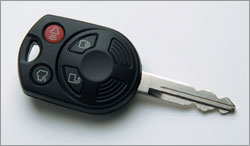
The first is the integrated automobile key with remote. I think BMW and Mercedes have been doing this for several years now. Most new cars today that include remote locks use this approach. The key pictured here is for a Ford Fusion. At the risk of sounding like Andy Rooney, it really bothers me to have too many items in my pocket. I keep the least amount of keys that I practically can on my key chain. Combining the remote and the key saves at least 30% of the space taken by separate components. I suppose that many more cars today use a remote system than did even five years ago, but there aren’t many other reasons why remotes could not have included the key since the day they were first introduced.

curved_rod.jpgAn even stronger example of a simple change that makes a big difference is the curved shower rod. By curving the rod outward from the tub, much more usable space is provided when the curtain is drawn closed. Models available today provide additional elbow room from six inches to an entire extra foot. If you’ve used a shower with a curved rod you know how much of a difference that extra space makes. I first came across a shower like this in a Westin hotel a few years ago, but just about every hotel I have stayed in the last year uses one now.

So, both of these design innovations are relatively new; they’re just now becoming common in the market. Why did it take so long to realize that such a simple change could make such a useful difference? How many other products or applications that we use every day could be more useful with just a simple tweak or change?

 
Leave a comment

Posted by on July 27, 2006 in design


Air Conditioner Hack

Here’s a non-computer design related entry. My friend Wayne inspired me to fix my air conditioner drain issue. Mine’s been leaking condensation into the overflow pan all summer. The overflow pan is doing its job, carrying the water away outside the house through a PVC line out to the eave. But rust is building in the pan, and the fact that water was dripping out meant it was flowing somewhere that it wasn’t designed to, and that is never a good thing.

The end result, an easier to maintain drainWhy was it leaking where it shouldn’t thus dripping into the overflow pan? Because the main line (a closed line from the air handler to the sewer line) must have been blocked. Given the system is over 35 years old, there’s no telling what gunk had built up in there over that time. But because the line goes right into the air handler without any connectors, I couldn’t find a non-destructive access to flush or snake the pipe. A bad design (a closed system) kept me from maintaining favorable conditions for maximum throughput.

Armed with various elbows, t’s, and connectors to fit my 3/4″ pipes, PVC primer and cement, a Dremel (I’m always looking for something to Dremel), and a brand new and wonderfully designed shop vac , I headed up into the attic.

The project took much longer than it should have for several bone-headed reasons I won’t go into now. But by the end, I had cut open the line and used the shop vac (and a few drain-cleaning chemicals) to get water flowing easily through the line again. When I put it all back together, I replaced the first elbow joint with a T and a cap so that every few months I can easily pour some bleach down the pipe to keep it clean.

The AC ran intermittently through the night (it might just be psychosomatic, but it felt like it ran cooler). In the morning, the overflow pan was completely dry. There’s still lots of rust in there, but cleaning that is a project for another day. Checking the pan again this evening, a full day of operation after the clean-out, it is still dry. I can assume that water is flowing out in the route it was originally designed, and holding up well during the year’s most active use.

So, why didn’t they install the pipe with an easy way to maintain it in the first place? Could have been time or cost constraints. Or, it could simply be that design often takes several iterations before an ideal solution is produced.

 
26 Comments

Posted by on July 24, 2006 in fribble


Tags:

my worlds collide – Stat City Tee

Data visualization and visual design combined on a cool looking t-shirt. Click the image to see a larger rendition. Using chart elements to create a sity(that’s what happens when I try to type Sim City too fast, then change my mind mid-sentence) city scene like Sim City. There’s even a legend on the side. If you look at the pictures of the models on the site, it looks like SharePoint Google Analytics (thanks, Jeremy) in the background.

Threadless is great. Jenny loves her Spanish Teacher and Scrabble shirts.

I can’t wait until mine arrives in the mail.

 
3 Comments

Posted by on July 20, 2006 in fribble